Widget Plugin System
The portal renders rich, interactive blocks — maps, listing carousels, blog cards, forms — from a single registry of widgets. Each widget is a self-contained plugin: it declares its props and validation in one place and can be dropped into any CMS page or embedded on an external site. This page is a live catalogue of every widget available for this tenant.
Contents
- How widgets work
- Base props
- Repliers API widgets
- Connected CMS widgets
- Forms & utility widgets
- Error handling
How widgets work
Every widget lives in a central registry that maps a name to a React component, a typed parameter schema, and a Joi validation rule. There are three ways to call a widget.
1. Markdown (braces) syntax — works in any CMS content:
[CarouselWidget title="New in Seattle" listings.city="Seattle"]
2. MDX component syntax — only inside .mdx files; props are typed natively:
<Widget name="CarouselWidget" title="New in Seattle" />
3. Iframe embed — for external sites; props come from the URL query string:
<iframe src="/widgets/CarouselWidget?title=New%20in%20Seattle&listings.city=Seattle" width="100%" height="520" />
Base props
Most widgets share a small set of base props:
title— optional heading rendered above the widgetsubtitle— optional secondary line under the titlebgcolor— background color (theme token or CSS color)size— visual scale where supported (small/medium/large)maxWidth— content width constraint (xs…xl)
Data-driven widgets also accept a nested listings.* object — any MLS query field (listings.city, listings.listingType, listings.listingStatus, listings.maxPrice, listings.sortBy, …) is forwarded to the Repliers search API.
Every param is validated before render. The schema declares its type, whether it is required, an optional defaultValue, and whether a single value is coerced into an array (forceArray). Invalid values surface as inline errors — see the last section.
Repliers API widgets
These widgets fetch live MLS listings from the Repliers API via the listings.* query. Examples use Seattle data.
CarouselWidget
A horizontally scrolling row of listing cards.
Key props: title, subtitle, buttonTitle, size (default medium), bgcolor, listings.*
Call in Markdown:
[CarouselWidget title="New condos in Austin" subtitle="Active listings" listings.city="Austin" listings.listingType=condo listings.listingStatus=active listings.resultsPerPage=8]
Call via iframe:
<iframe src="/widgets/CarouselWidget?title=New+condos&listings.city=Austin&listings.listingType=condo&listings.resultsPerPage=8" width="100%" height="520" />
Live example:
CarouselWidget (large cards)
The same widget with size=large and a different query — here a tenant "featured" feed instead of a city/status filter. It also sets the optional buttonTitle prop: when present, a button is rendered below the cards that opens the full map view, preloaded with the same listings filters and auto-centered on the results.
Call in Markdown:
[CarouselWidget title="Featured homes" bgcolor="white" subtitle="Large cards" buttonTitle="View all on map" size=large listings.sortBy=createdOnDesc listings.resultsPerPage=24 listings.source=featured listings.slug=matt]
Call via iframe:
<iframe src="/widgets/CarouselWidget?title=Featured+homes&bgcolor=white&subtitle=Large+cards&buttonTitle=View+all+on+map&size=large&listings.sortBy=createdOnDesc&listings.resultsPerPage=24" width="100%" height="620" />
Live example:
GridWidget
A paginated grid of listing cards.
Key props: title, maxColumns, size, pagination, pageSize, listings.*
Call in Markdown:
[GridWidget title="Recently sold in Austin" listings.city="Austin" listings.listingStatus=sold listings.sortBy=createdOnDesc maxColumns=3 pagination=true pageSize=9]
Call via iframe:
<iframe src="/widgets/GridWidget?title=Recently+sold&listings.city=Austin&listings.listingStatus=sold&maxColumns=3&pagination=true&pageSize=9" width="100%" height="900" />
Live example:
MapWidget
An interactive Mapbox map with listing markers. Carries its own map state provider, so multiple maps on one page stay independent.
Key props: title, subtitle, width, height (default 400), zoom (default 10), center, markerSize, fitToListings, zoomButtons, styleButtons, scrollZoom, listings.*
Call in Markdown:
[MapWidget listings.city="Austin" listings.listingType=condo height=460 zoom=14 zoomButtons=true styleButtons=true]
Call via iframe:
<iframe src="/widgets/MapWidget?listings.city=Austin&listings.listingType=condo&height=460&zoom=14" width="100%" height="540" />
Live example:
MapGridWidget
A combined map + grid with a layout toggle. Like MapWidget, it owns its map state.
Width works in card columns: maxColumns sets the total width, gridColumns sets how many columns the grid beside the map uses, and the map fills the rest. When gridColumns is omitted it is derived automatically (up to 2), so the map and grid are always both visible.
Key props: title, subtitle, maxColumns (default 4), gridColumns (auto), height, mobileHeight, layoutSwitch, pagination, pageSize, zoom, center, markerSize, listings.*
Call in Markdown:
[MapGridWidget title="Browse Austin condos" listings.city="Austin" listings.listingType=condo layoutSwitch=true pagination=true]
Call via iframe:
<iframe src="/widgets/MapGridWidget?title=Browse+condos&listings.city=Austin&listings.listingType=condo&layoutSwitch=true" width="100%" height="640" />
Live example:
Connected CMS widgets
These widgets read content from the connected CMS (blog posts, static pages). They require the blog feature, which is enabled for this tenant. Slugs below are sample URBN content — adjust to live slugs as needed.
BlogPostWidget
A single blog post rendered as a horizontal card. Select by index (latest first) or by slug.
Key props: slug, index (default 0), category, tag, title, showCategory, bgcolor
Call in MDX:
<Widget name="BlogPostWidget" index={0} showCategory={true} bgcolor="white" />
Call via iframe:
<iframe src="/widgets/BlogPostWidget?index=0&showCategory=true&bgcolor=white" width="100%" height="320" />
Live example (latest post via MDX syntax):

Alex Strelets
December 4, 2025
Donec ultrices ipsum id nisl finibus, id ullamcorper leo semper. Vestibulum auctor sapien ac laoreet ultrices. Nulla imperdiet posuere velit at tempor. Nulla viverra, metus et euismod feugiat, tellus erat ultrices risus, quis tempor leo magna sed nunc. Mauris posuere sit amet urna sit amet elementum. Nam non lacus at diam dapibus posuere sit amet […]
Read Full ArticleCall in Markdown:
[BlogPostWidget slug="10th-post-of-the-test-blog-to-integrate-it-with-nextjs-and-third-party-web-sites" showCategory=true bgcolor=white]
Call via iframe:
<iframe src="/widgets/BlogPostWidget?slug=10th-post-of-the-test-blog-to-integrate-it-with-nextjs-and-third-party-web-sites&showCategory=true&bgcolor=white" width="100%" height="320" />
Live example (specific post via slug):

Alex Strelets
December 4, 2025
Suspendisse ac interdum eros. Quisque auctor euismod nisl eget blandit. Aliquam non fringilla urna. Aenean laoreet erat urna, vel fringilla nibh dapibus quis. Nunc efficitur, lectus non feugiat vulputate, enim mi aliquam sapien, vel pulvinar metus lectus id sem. Sed consequat arcu vitae fermentum maximus. Quisque non mattis dolor. Proin elementum est vel lacus vestibulum […]
Read Full ArticlePageWidget
Embeds the body of a static CMS page by slug.
Key props: slug (required), title, maxWidth (default md)
Call in Markdown:
[PageWidget slug="about" bgcolor="white"]
Call via iframe:
<iframe src="/widgets/PageWidget?slug=about&bgcolor=white" width="100%" height="600" />
Live example:
Forms & utility widgets
Lead-capture forms and presentational blocks that do not depend on MLS data.
ContactWidget
A contact form that submits to the tenant's lead pipeline.
Key props: title, subtitle, bgcolor, submit, showMessage (default true), message, redirectUrl, formAlign
Call in Markdown:
[ContactWidget title="Get in touch" subtitle="We usually reply within a day"]
Call via iframe:
<iframe src="/widgets/ContactWidget?title=Get+in+touch" width="100%" height="560" />
Live example:
SubscribeWidget
A single-field newsletter sign-up.
Key props: title, subtitle, bgcolor, submit, redirectUrl, formAlign
Call in Markdown:
[SubscribeWidget title="Subscribe to updates"]
Call via iframe:
<iframe src="/widgets/SubscribeWidget?title=Subscribe+to+updates" width="100%" height="320" />
Live example:
EstimateWidget
An embedded "what's your home worth?" estimate entry form.
Key props: title, subtitle, submit, height, showLogo, maxWidth (default md), bgcolor, target, formAlign
Call in Markdown:
[EstimateWidget title="What's your home worth?" subtitle="Get an instant estimate"]
Call via iframe:
<iframe src="/widgets/EstimateWidget?title=What%27s+your+home+worth%3F" width="100%" height="420" />
Live example:
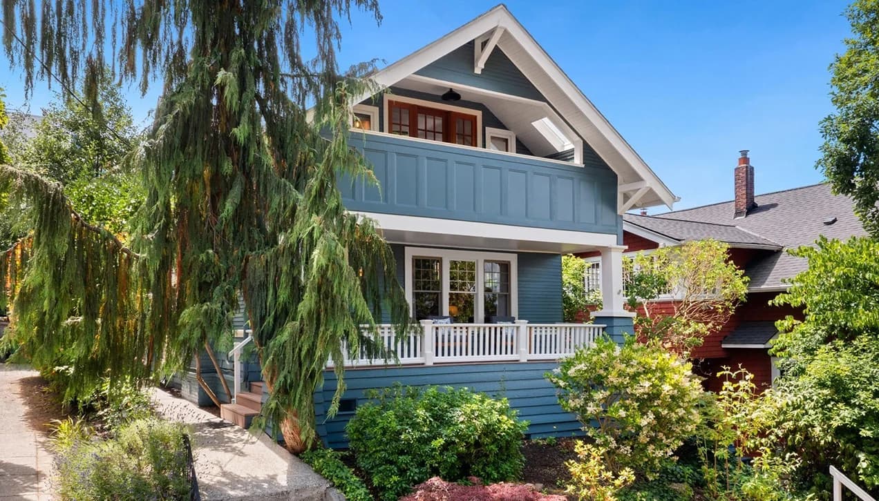
What's your home worth?
Get an instant estimate
YouTubeWidget
Renders the tenant's configured YouTube feed.
Key props: title, subtitle, maxResults (default 2), feed, bgcolor
Call in Markdown:
[YouTubeWidget title="Latest videos" maxResults=3 bgcolor="white"]
Call via iframe:
<iframe src="/widgets/YouTubeWidget?title=Latest+videos&maxResults=3&bgcolor=white" width="100%" height="420" />
Live example:
Error handling
The widget system fails safely. Invalid props are reported but never crash the page, and unknown widgets render a debug placeholder.
Invalid prop values (Joi validation)
TestWidget restricts colors to a fixed palette. An unknown color is reported above the widget while valid props still render.
[TestWidget title="Invalid colors" count=10 colors="invalid-color" colors="red"]
Live example:
Missing required prop
TestWidget requires count. Omitting it surfaces a validation error.
[TestWidget title="Missing required count"]
Live example:
Unknown widget (Markdown)
An unregistered name renders a placeholder listing the widget name and the props it received.
[CompletelyMadeUpWidget foo="bar" count=3]
Live example:
Unknown widget (iframe)
The same safe fallback applies to iframe embeds.
<iframe src="/widgets/CompletelyMadeUpWidget?foo=bar&count=3" width="100%" height="172" />
Live example:
